COMIC BOOK REVIEW: The Multiversity: Mastermen #1 is the weakest link


Grant Morrison’s THE MULTIVERSITY continues to receive more critical appraisals primarily on how surprisingly accessible compared to its legitimate successor FINAL CRISIS, and pushing further his brand of meta-narrative to the broader spectrum altogether. Naturally, he needs a cadre of high caliber illustrators in the DC stable to make his uber project a reality. This […]
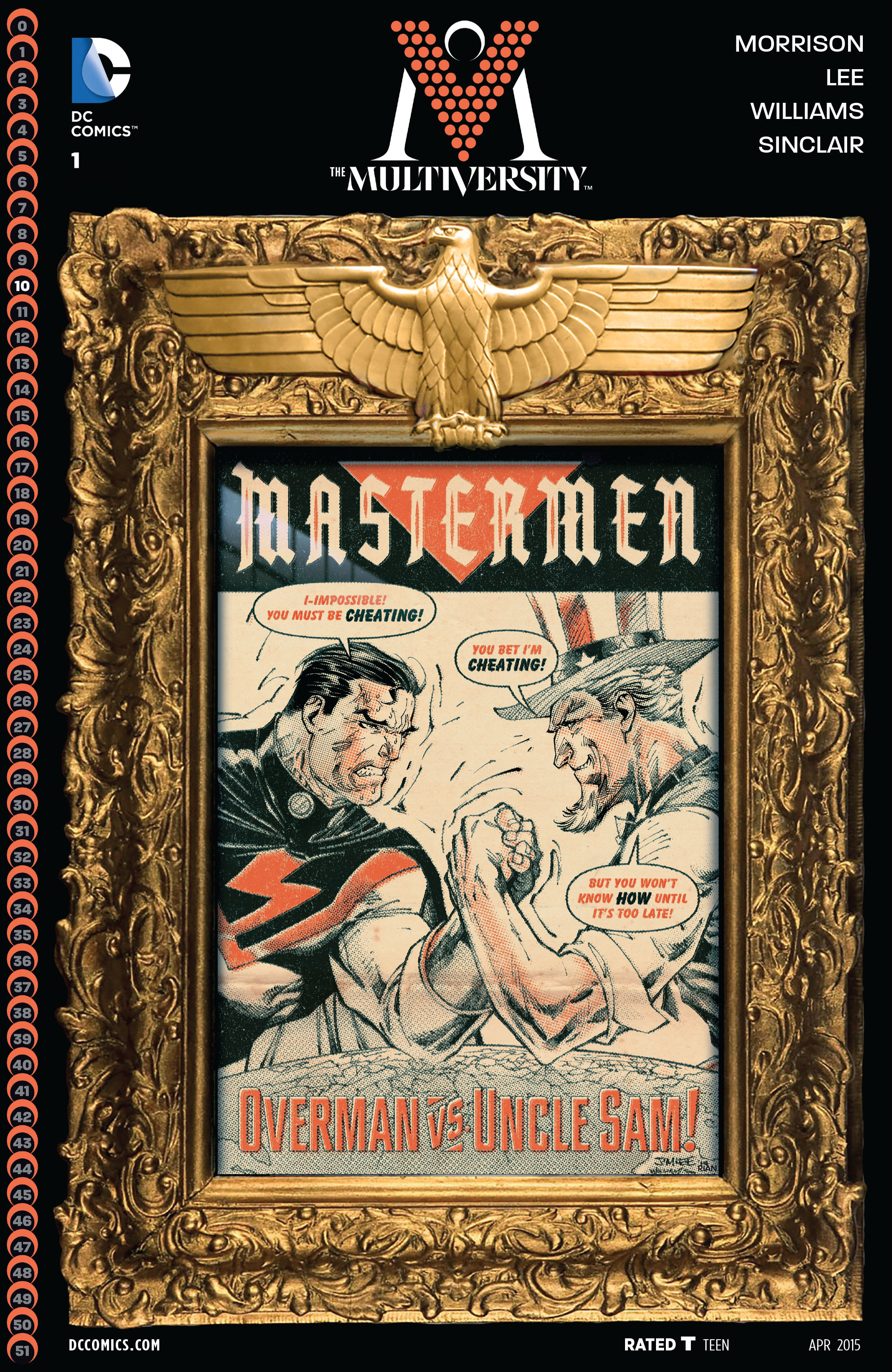
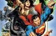
Grant Morrison’s THE MULTIVERSITY continues to receive more critical appraisals primarily on how surprisingly accessible compared to its legitimate successor FINAL CRISIS, and pushing further his brand of meta-narrative to the broader spectrum altogether. Naturally, he needs a cadre of high caliber illustrators in the DC stable to make his uber project a reality. This time around, his latest chapter, THE MULTIVERSITY: MASTERMEN #1 takes center stage. And to add more spice on it for the reading comic public is that iconic artist – Jim Lee illustrates not only the cover but the interiors as well. Sounds a célèbre here? With all due respect, I end up so disappointing. Please bear with me here for it’s so painful to do so.
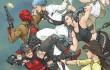
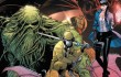
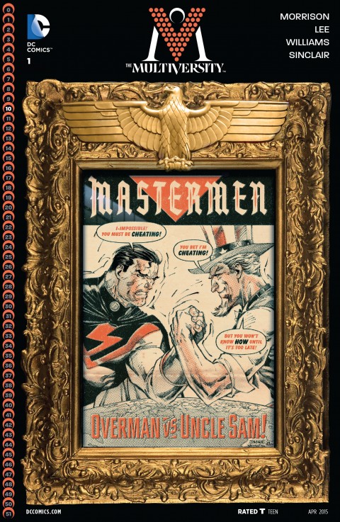
It focuses on Earth 10, one of DC’s 52 universes. And, it stars Overman, the Nazi-inspired/grown version of Superman. The challenger is Uncle Sam, America’s true symbol of anything, well, America. Just like most previous issues, I need to pace myself in reading, deciphering, comprehending, digesting, and nitpicking on Grant’s mambo jumbo grandeur Fourth-Wall smashing moments. Sure, his style exists, but sadly, only the “narrator” and a couple of dialogues explicitly present that matter in hand. I was actually reading a guilt-ridden diary entry of the main character here. Basically, this is a very straightforward tale of delusions and failures in spite of the challenges and victories Overman achieved. Granted, Uncle Sam poised the challenge, as implied on the cover art. But no, the anti-thesis did challenge INDIRECTLY the challenger. Just read the dialogues on the cover itself to see HOW exactly Uncle Sam wins eventually.
The most disappointing in this chapter is no other than Jim Lee. Yes, you read me right. I’m a true Jim Lee fan since the height of his X-men years, mesmerizing his female illustrations (PSYLOCKE!), and even arguing and defending his brand of artwork to those who question his “majestic” illustrative (and sluggish) style. I have some Omnibuses and Absolutes, and other hardcover editions that have his name printed. That is how JIM LEE matters to me, then and now. He’s my numero uno. But this time around, I must say his work is so disheartening!
The opening pages averaged from above average to good, but the succeeding interiors ranged from average to downright ridiculous. The scenes of the Fuhrer in the toilet (reading a pastiche of a Captain America comic in the guise of Superman, obviously) presented already Lee’s decline as a “majestic” caliber level artist. Some noticed already in his previous last series, Superman Unchained, but that situation was lessened due to the fact he had the time to refine his work. Yet in the case of Mastermen, many of his illustrations were so bad, they really sucked. For examples, in one splash page that showed the entire team, Earth 10’s Batman-mirror’s legs were so oversized, akin to the infamous Rob Liefield’s illustrations! So glaring that they were actually muscled, not stuffed with gadgets whatsoever. The faces of basically almost everyone were so unattractive, most particularly the Aquaman archetype. Lee littered with so many lines in the faces in the guise of making them a bit rugged and majestic, but still so ugly nevertheless. Are we witnessing the decline and fall of Jim Lee as the premier artist? It really, really hurts me a lot, similar to the experience I had with Frank Miller as the writer (All-Star Batman and Robin and beyond). And this begs a question, was this chapter rushed to accommodate the event’s timetable? From the looks of it, I could say YES, it was indeed rushed to Lee’s illustrating style. Furthermore, he failed to grasp Grant’s subliminal and implied messages that demand more time and space to internalize the meanings the author tried to convey. Lee’s splash pages surely failed to help either. In other words, Grant and Jim failed to synchronize one another.
Other points here are the prior knowledge of Final Crisis to new or uninitiated readers to somehow have an idea or two on the background of Earth 10 and the events that transpired. I started so optimistic in this one, but finished up so “cheated”, to borrow the word from the cover art itself. I will just wait up two or three more chapters (and hopefully brings back my interest) next month or so.
Rating: 3.25/5