COMIC BOOK REVIEW: Clockwork Angels #1
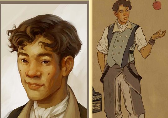
 Boom! Studios’ Clockwork Angels #1 tells us the story of Owen Hardy and his first steps towards a bigger adventure. Owen’s a teenager who dreams big and wishes to get out of his hometown, a community that seems to be perfect in every way thanks to the architect and ruling entity, the Watchmaker. In this issue, we get to see how Owen has to leave behind his peaceful life, the people he grew up with and even his fiancee, to pursue his aspirations and travel the land beyond his small village. He’s got his facinations towards how the world works, most especially the Clockwork Angels, who as their names suggest, function so that everything works in a clockwork fashion.
Steampunk, socio-political story, a big conflict with a ruling authoritarian body and the gray areas of the concept of peace. It looks like Clockwork Angels will be heading towards all of those under the pen of Kevin J. Anderson and Neil Peart. The story in this issue however, despite having all the things I really like, disappointed me. The world seems to be very rich and the story wants to make it known that there’s a lot of things out there but there’s nothing to make you excited about them. Initially the book caught my attention because of its theme. But there’s the ambiguity that prevents the reader from knowing how steampunk or how dystopian/utopian this world is. How does the Watchmaker control the rain? Or more than that, how does it even rain in this world where even the weather’s scheduled? The town seems antique, where’re the vehicles? We know it’s steampunk and that’s intriguing and interesting but that’s just it, as if the book’s steampunk only by name without showing us the good stuff.
There were some very intriguing terms like the Watchmaker, Clockwork Angels, Crown City, alchemy and anarchists. There are trains that flare up in the sky, powered by what seems to be blue energies we know nothing of. The Angels are said to enfore the Watchmaker’s wills but how and why? For a first issue, of course there’s a lot to be explained. They could be left for later but it seemed they weren’t even trying to pique interest, too many things thrown out there but none to back them up. On their own, they’re just cool words to put on the book instead of being sprinkles of the bigger world’s richness.
The story has done a great job in making it look like Owen’s village is really “the” perfect village thanks to its benefactor. Peaceful, systematic and organized. Or rather, too peaceful, too systematic and too organized. The book’s going towards a dystopian setting and it began with a utopian village, and it’s doing so well that it robbed the initial issue of the tension, excitement and pace. Despite the flashback and narration and all the cool terms, by the end of the book it felt that the story’s dull and lifeless. If that’s what the authors’ going for, then two thumbs up as we’re not sure if they’re working for something grand later on to put in contrast to this issue. But if not, then things should really pick up in the next one.
As for the artwork, I have to say Nick Robles has done a very great job that made me read to the very end despite the rants I’ve previously mentioned. All in all, the illustrations are damn good, something I noticed from the get-go from the current time in the initial pages towards the flashback that brings us our story. The book showcases a very appealing art that shares the same feel as animated movies. The characters look enjoyable to see and I really loved the classic imagery in the book. Robles has put in quite a lot into the natural and very peaceful sceneries such as that of the town and meadows. They’re very pleasing and stark contrast to the artifical look of those blue jolts coming out of the train and reddish iron and. What are those blue jolts anyway? We don’t know yet but the colors are vibrant enough that they jump out of the page and readers would get the idea that it seems technologically advanced bordering magical in some way. At that point, there’s a subtle hint of what kind of world the characters are living in.
I’ve been disappointed with how the first issue went, yes. Not only is the setting cliché (dystopian steampunk setting, young boy dreaming of exploring the bigger world), but the pace and how the story itself seemed very lacking for an opening. But there’s the promise of a bigger next issue. Also, I’d love to see Nick Robles art in action once again. All my points for this issue goes to Robles’ art and if the steampunk world would get full-blown in the next issues of Clockwork Angels, then that art would be something to look at.