COMIC BOOK REVIEW: Superior Iron Man # 1 – The Show-Off


Raves
Rants
You might be living in a cave if you don’t know who Tony Stark is. A self-proclaimed genius, millionaire, playboy and philanthropist- a person almost everyone wants to be. He also wields the most technologically-advanced armor in the world and is more known as the armored Avenger – Iron Man.
 You might be living in a cave if you don’t know who Tony Stark is. A self-proclaimed genius, millionaire, playboy and philanthropist- a person almost everyone wants to be. He also wields the most technologically-advanced armor in the world and is more known as the armored Avenger – Iron Man. Not known to many though, Tony Stark/Iron Man wasn’t always the person to admire. One of the inspiration of his creation was to be the antithesis of Peter Parker/Spider-man – the epitome of altruism. In other words, Tony Stark was a rich, abusive, hedonistic, drunk war-profiteer – not really someone to look up to. Thankfully, he did not stay that way and showed us that anybody can change for the greater good. But what if someone who changed to become a better person thinks he’s superior than everyone else?
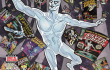
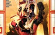
The creative team of writer Tom Taylor (Injustice: Gods Among Us, Earth 2), newcomer Yilidray Cinar and colorist Guru-eFX (Iron Man Vol. 5, Nova) has an answer to that question in Superior Iron Man #1. The story take place after the Marvel-wide event Axis: Inversion – where heroes and villains present in the battlefield against the Red Onslaught had their personalities altered – heroes became villains and villains became heroes. Writer Tom Taylor shows us that Stark does not become a full-blown villain because of the Axis: Inversion event but becomes more in touch with his old egoistic self. Superior Iron Man #1 also entails the reasoning of him sharing his creation the Extremis 3.0 app which could enhance a person’s physical appearance for free and it ain’t pretty.
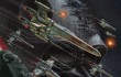
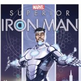
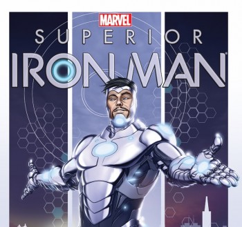
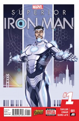
One thing to note about a new Iron Man series is Tony Stark’s design of his new armor. It does not have a hint of the classic red and gold combination we all are familiar with and he now dons a “Look at me, I’m shiny!” silver and gray color scheme with lots of lights all over it. Costume design was appropriate and certainly shows what a self-centered person should wear.
With a story-arc so simple and predictable, one would expect that the art would compensate for this. This is where Superior Iron Man #1 really falls-off. Most of the times, a “#1″ title would have consistent and beautifully drawn art from cover to cover but Superior Iron Man # 1 was riddled with lots of inconsistencies. I have seen what artist Yildiray Cinar and colorist Guru-eFX can do and I know they can do better. The title suffers from poor lighting effects and contrast problems causing dark objects to become too dark while light-shaded colors appear too pale. This is evidenced by his new shiny armor as it certainly lacks some polish as it isn’t flashy enough. This is also true for the character models, pretty people appear pretty while the not-so-blessed people just look sick. This is certainly not the way to go for a #1 title to catch new readers or retain old ones. Overall, the issue was good but not great.
If you were eagerly waiting for Superior Iron Man #1 to see Iron Man go full-blown villain, you will surely be disappointed. But, if you want to see how a self-centered Iron Man driven by greed and alcohol still become a hero then this is the title for you.
- Related:
- Marvel Comics