REVIEW: Those meddling kids and their dog goes modern in ‘Scooby Apocalypse #1′


Raves
Rants
Scooby-Doo defined most of my childhood through solving mystery after mystery whether it was the cartoons, video games, merchandise, movies or even the occasional comics. This name was the very reason why I would always be interested in any story that’d involve mysteries. Once I found out that DC Entertainment announced about Scooby Apocalypse, […]

Scooby-Doo defined most of my childhood through solving mystery after mystery whether it was the cartoons, video games, merchandise, movies or even the occasional comics. This name was the very reason why I would always be interested in any story that’d involve mysteries.
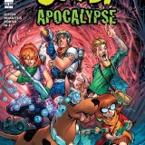
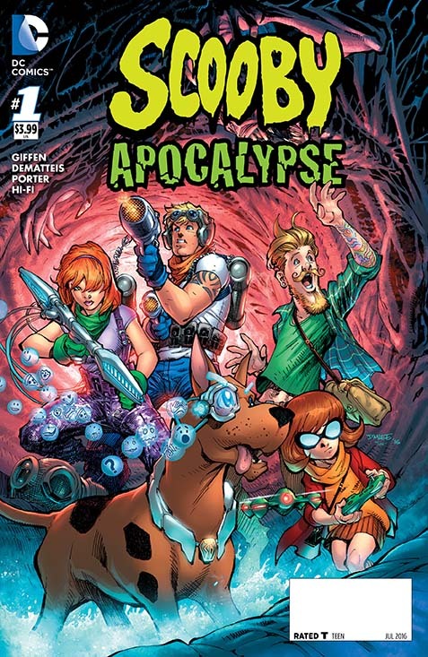
Once I found out that DC Entertainment announced about Scooby Apocalypse, I was a bit surprised by the cover because of the whole hunting team vibe it brought. Having another look, I was guessing that while this comic was gonna be different from the cartoon it was gonna retain a bit of the spirit from the cartoon which cleared my worries that it won’t be a complete departure.
Based on Jim Lee’s concept, Keith Giffen and J.M. DeMatteis start Scooby Apocalypse #1 by giving us an origin story on how the Mystery Inc. we’ve come to know formed and instead of a “Mystery of the week/Mystery of the issue”, we’re treated to a setup on what this group’s facing. The setup for what’s to come and the introduction for each character are what gives good weight for this debut issue though the only problem with this is that with all this focus, there’s no clear sign with what tone this comic wants to go for yet.
Howard Porter’s pencils and inks & Hi-Fi’s colors make for a great combo whether you’ve already seen their work in Justice League 3000 or this is your first time, the overall art is quite the spectacle to look at. For something titled “Scooby Apocalypse”, the art’s quite colorful from the scenery to the characters themselves and another thing to note here is that despite the obvious departure from the cartoon, you can still tell by the designs of the characters that the cartoon’s spirit is still alive here.

While it looks like a departure from the old Scooby-Doo cartoon, Scooby Apocalypse #1 does retain the visual appearance of the characters we’ve come to know and love while giving them modern touches and getting a much wider story than the cartoon’s continuous mystery solving. The introduction of the members of Mystery Inc. and the amazing artwork are this debut’s strengths. With such strengths there’s bound to be a weakness here. That weakness being that the comic doesn’t know what tone it wants to go for which should be answered by the next issue.